Works/Orbit

Orbit cut onboarding drop-off by 41% with a calmer money app

Client
Orbit Financial
Industry
Fintech · Series B
Services
Product design, Design system, Motion
Year
2025
Timeline
12 weeks

About project

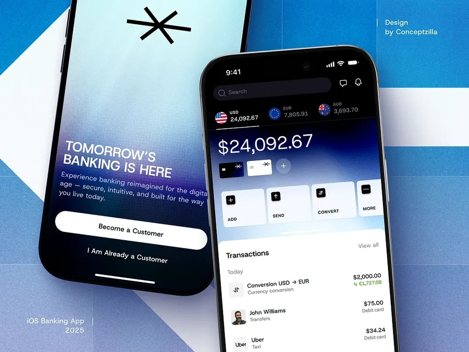
Orbit is a consumer banking app that had grown feature by feature until nobody could see the whole of it. Onboarding ran to eleven screens, half of all new users never funded an account, and every squad shipped its own components. Visuolab rebuilt the first run and the system underneath it so money feels calm again — without pausing the roadmap.
41%less onboarding drop-off
2.3×accounts funded in week one
4.8App Store rating, up from 3.9

How it went

Four phases, one team throughout

  1. Step #1

    Discovery

    2 weeks

    Interviews with fourteen customers, funnel analytics and an audit of every onboarding screen.

    • Onboarding flow6 screens
    • Home, cards & transfersiOS · Android
  2. Step #2

    Design

    5 weeks

    New onboarding, home, cards and transfers — tested as prototypes with real customers every week.

    • Design system40 components
    • Motion guidelinesFigma + Lottie
  3. Step #3

    Build

    4 weeks

    Design system tokens shipped to React Native; our design engineer paired with Orbit's squads.

    • Figma libraryTokens, docs
  4. Step #4

    Launch

    1 week

    Staged rollout to 10%, then everyone, with instrumentation on every step of the new flow.

    • Handoff & QA4 weeks

Challenges

What we had to solve

  1. 01

    An onboarding nobody finished

    Eleven screens stood between download and a funded account, and half of new users gave up before the end.

  2. 02

    Four squads, four design languages

    Every team shipped its own buttons, spacing and motion, so the app felt stitched together.

  3. 03

    No pause button

    The roadmap kept moving the whole time — the redesign had to ship alongside live features, not instead of them.

What changed

Results

  • 41% less onboarding drop-off
  • 2.3× accounts funded in week one
  • 4.8 App Store rating, up from 3.9
  • Eleven screens became six. Each asks one thing and says why it's needed.
  • Identity checks moved to the first transfer, not the first minute. Funded accounts doubled.
  • Forty components with motion rules, so new features look like they were always there.

More work

Other projects worth a look

All projects
+You

Ready to discuss your project with us?

Tell us where you are and where you want to be. We'll come back within a day with how we'd get you there.